Field Notes 3-Pack - "Fifty" Memo Book
4 × 12 + 2 = 50
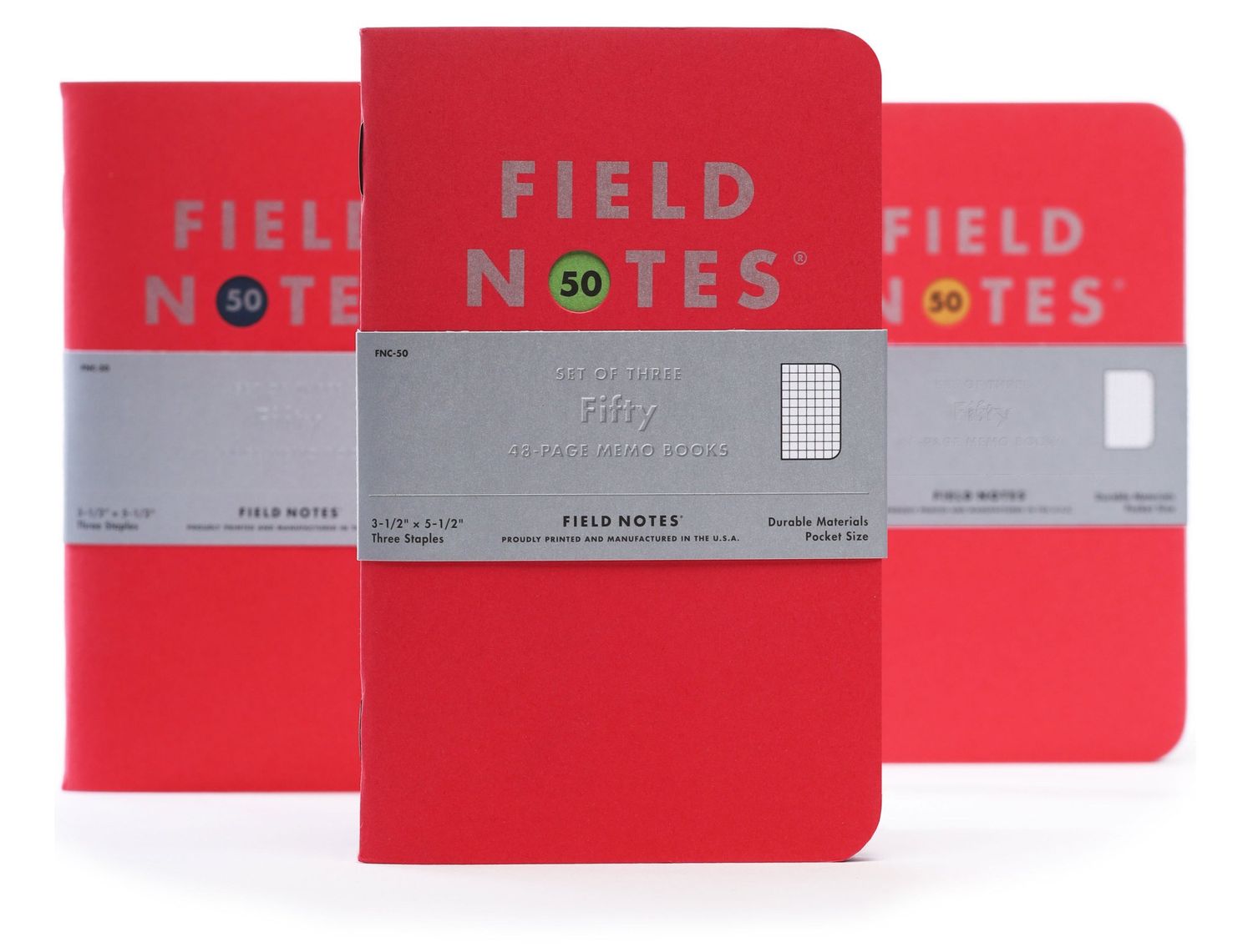
Our latest Quarterly Edition commemorates the forty-nine preceding releases in our ongoing series that started with designing “Butcher Orange” way back in 2008. We’ve gone back to basics for the 3-Packs. Simple, beautiful, “Red Hot” French Paper Co. covers with silver metallic ink, surrounding 48 pages of silver Graph Grid. Metallic ink on a colored cover first appeared in our 5th release in 2009, “Just Below Zero,” and has made an appearance here and there since then.
We’ve used a lot of French Paper over the years but surprisingly this is our first use of Pop-Tone “Red Hot” stock. The books also feature an almost-blank flyleaf, with a Futura “50” peeking through a die-cut circle. Each 3-Pack contains three different flyleaf colors recalling a specific Quarterly Edition: Safety Orange from “Dime Novel,” Nightshift Blue from “End Papers,” and Gumdrop Green from “Grass Stain Green.”
In creating this set, we’ve been thinking a lot about all the editions that came before it, and what — if anything — we can conclude from this anniversary. Jim took a stab at it in his essay, “Counting to Fifty.”

